
The Kennedy Institute of Ethics at Georgetown University is one of the world's oldest academic ethics centers.
As its primary in-house designer, I led the evolution of its core and peripheral brand identities at two distinct inflection points in its growth: in 2014, to mark the beginning of a strategic pivot, and again in 2016–2017, to consolidate the success of multiple pilot projects and more boldly announce the Institute's refined mission and orientation.
2014
Beginning a Pivot
In 2014, the Institute was entering the earliest public phase of a massive internal reorganization and shift in funding structure. New audiences needed to be reached without alienating old allies and existing partners, or compromising the Institute's most critical brand asset: a sterling academic reputation.
Working closely with the Institute's director, I led a half-year redesign of the Institute's existing digital and physical spaces which aimed to do just that.
The institute's existing logotype was in a classic font—Garamond—but featured awkward kerning and no consistent guidelines for use. Most of the Institute's promotional materials—print and digital—leaned heavily on images and iconography that referenced the subject matter of bioethics, its scholarly field: stethoscopes, globes, lab rats. Bright colors intended to project youthful energy often clashed with the images, definitely clashed with the typography, and generally came off as unserious—incredibly inappropriate for an institute whose scholars shape policy on topics like abortion, physician-assisted suicide, and wrongful death. The Institute's homepage design was dated, and used a custom CMS few on staff could manage.
I developed a new brand strategy designed to capitalize on the Institute's longstanding reputation for academic excellence while signaling a move into the 21st century. The new look and accompanying materials needed to communicate the Institute's connection to the University in which it was housed, as alumni and supporters were now an important means of financial support, while still signaling autonomy, rigor, and seriousness to granting agencies (another critical new funding stream) and the next generation of faculty the Institute was ramping up to hire.
Centered the core pillars of academic rigor, philosophical depth, and university affiliation, the new brand framework re-kerned the old logomark and restricted it to classic b/w use, pairing it with rich imagery and a new, sophisticated color palette.
A redesigned and fully-responsive website built on Wordpress shone a spotlight on faculty research and made revenue-generating curricular programming more prominent. Its new homepage displayed as its hero image one of seven 19th-century oil paintings from the medical realism movement, intended to signal gravitas, gesture to the Institute's role in the founding of the field, and suggest a willingness to explore the human side of bioethical issues.
A suite of promotional and print materials played up the Institute's location in iconic Healy Hall at the heart of Georgetown's campus, while using shades from the new color palette that stood out from the sea of blue and gray university materials donors and supporters typically receive from other entities on campus.


The rebrand extended even to a redesign of the Institute's central offices, with a desaturated teal and creamy ochre palette for the walls and kitchen.

The 2014 homepage randomly displayed a new image each time the page was loaded.


Faculty research, donor-supported programming, and revenue-generating courses take center stage on the new, fully responsive site.
Over the next two years, the Institute would go on launch or radically revamp nearly a dozen new programs and events. To protect the Institute's reputation, most of these new offerings—many experimental or donor-supported—were given novel brand identities as they came online. Programs with demonstrated success and alignment with an evolving mission would be gathered up two years later in a yearlong rebrand and brand unification campaign designed to consolidate success and boldly signal a new direction for the Institute.
2016
consolidation and unification
By mid-2016, the Institute was ready to consolidate and institutionalize a number of successful new programs, and signal its evolving identity and mission.
I worked closely with the director and other leadership on a new visual identity for the Institute to plan a yearlong brand unification campaign that would pull a variety of disparately-branded programs—including institutional pillars such as a library, a journal, and an innovation lab—under one clear umbrella.
Part of the Institute's strategic shift included an intention to hire faculty and build programming in new, cutting-edge areas of applied ethics. This was both an affirmation of the founding spirit of the Institute—which helped to birth the field of bioethics, a totally new field at the time—and a shift away from its more recent history, which had consolidated scholarly strength in more traditional areas. The new design also needed to double-down on the Institute's status as an integral part of the University in which it is housed, since much of the fundraising and programmatic success of the past two years had relied on that connection.

The brand strategy I developed was based on a new logomark that emphasized ethics rather than bioethics, moved further into the twenty-first century with complimentary font treatments, played even more nicely with existing University branding, and pulled the boldest color from the 2014 palette right into the mark itself.
A set of overlapping geometric shapes that form the background of the new logomark served as a container to hold simplified versions of all existing identities, whose websites and associated digital, print, and event collateral were drawn under the umbrella one by one, culminating with a top-to-bottom redesign of the Institute's flagship Bioethics Research Library website.
The new sites were built as variants on a custom theme designed to reflect, but not match, the Institute's homepage. A global header and footer tie all pages back to the Institute and the University with logos and links.
The Institute homepage itself got a minor facelift as well to incorporate the new look. Oil paintings of old white men were out, replaced by an image of Georgetown's iconic Healy Hall, and a new suite of digital and social materials—including an intensified social strategy and monthly letter from the Institute's director—rounded out the central brand refresh.


Disunified programs were given a unified logo treatment that offered some continuity with their prior branding.


Six different sites on varying platforms were brought to central management via custom parent and child themes on Wordpress.
[Click image to visit live site.]


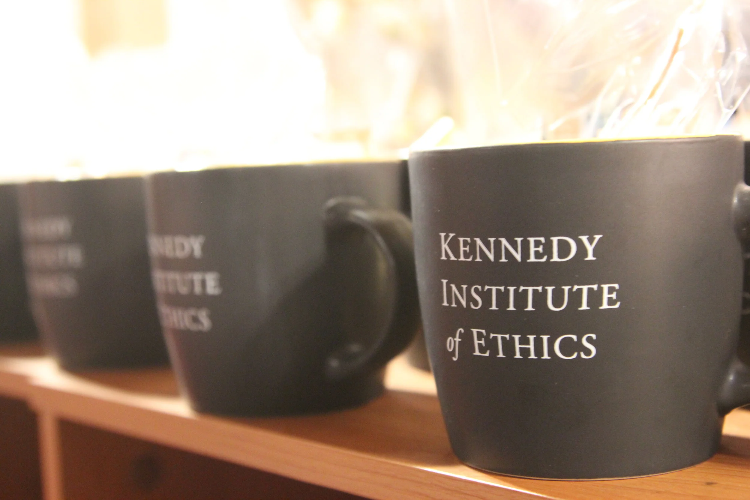
The newly-consolidated brand identities took center stage at a 2016 cocktail party celebrating a major donation and new path forward. [Click image to expand.]